Analysis of another run club itineraries
Following my first study of a run club itinaries called Run Rite I have started the same analysis for another run club I joined early 2023, this club is called de Grâce Running Collective or NDGRC.
What is interesting about these two clubs is the community, always nicer to spend time with good people. Those two groups know each other and they share a commun feature: they start and finish from the same location (I mean different for each club) and the path changes each time.
It’s an ongoing work where the graphs I’m producing with become nicer I hope. And all Python code to generate those images and maps can be found on my github repository dataviRun.
Average distance ran per season:
About 28 social runs for season 1 and an average of 8.14km per run.
About 36 social runs for season 2 and an average of 7.96km per run.
About 3 social runs for season 3 and an average of 7.18km per run.
Datavisualization by season
NDGRC is in its second season which goes from January to January and below is a datavisulaization of the first season 2023-2024 to the actual number of runs since early January for season 2024-2025:
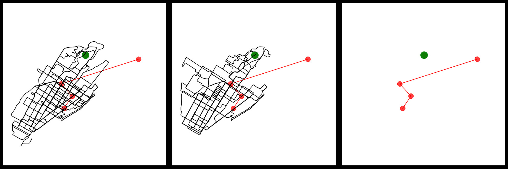
The red dot symbolizes the starting and ending point of each run.
The green point is pointing on Summit Circle on the top of Westmount.
Bonus track
Using folium I managed to overlay the gps run traces on the top of a map, and you can interactively zoom in and out. Of course you still need some guidances if you want to know more about those data, but you can guess from where the runs have started over the years. What it shows is the paths the run club was following from 2017 to summer 2024 at least.