Analysis of a run club itineraries
Introduction
I like data, I run a lot and I enjoy looking at the heatmap my activities are generating over the years.
A few weeks after joining Strava I found a way to import all previously recorded activities from other plateforms, and I was very happy to look at all of this information. One the thing I like the most is to overlay my paths over a map, this helps to find new ways to explore for my next runs.
Solo to social runs
What change in 2020 with the Covid time of our life was for me to join run groups for the first time (I’m based in Montreal). I was usually running alone and once in a while joining friends for an official run somewhere, but the training or casual runs remains a lonely thing.
I’m part of a few run groups now and one in particular called Run Rite is almost every week in my calendar since summer 2021. Putitng aside it is a nest infested of good people, his modus operandi is a treat: we start together, we finish together, we start from one location, we reach the top of the same hill every week and we come back to where we started. The number of people varies, the path we follow always changes and the fun remains intact.
The group started in September 2017 and I joined them in August 2021, since the beginning of RR four different starting points have been used and I slowly became curious about the patterns we were following. The path is chosen in live almost, the run leaders in front of the group will lead and decide, only a distance estimation is announced, but mostly to stop the people asking for how long we will go. Plus it’s almost the same distance each time and it’s never boring.
Diving into the data
The last two weeks I have been gathering all the run paths that group was following since it started, organizing those data in my own database in order to extract more easily or naturally information about them, this in a form of numbers or visualization:
- how many runs did we do?
- what is the average distance we do?
- what space do we cover?
- …
And you can check my datavizRun repository to look at the tools I made for me.
Getting numbers
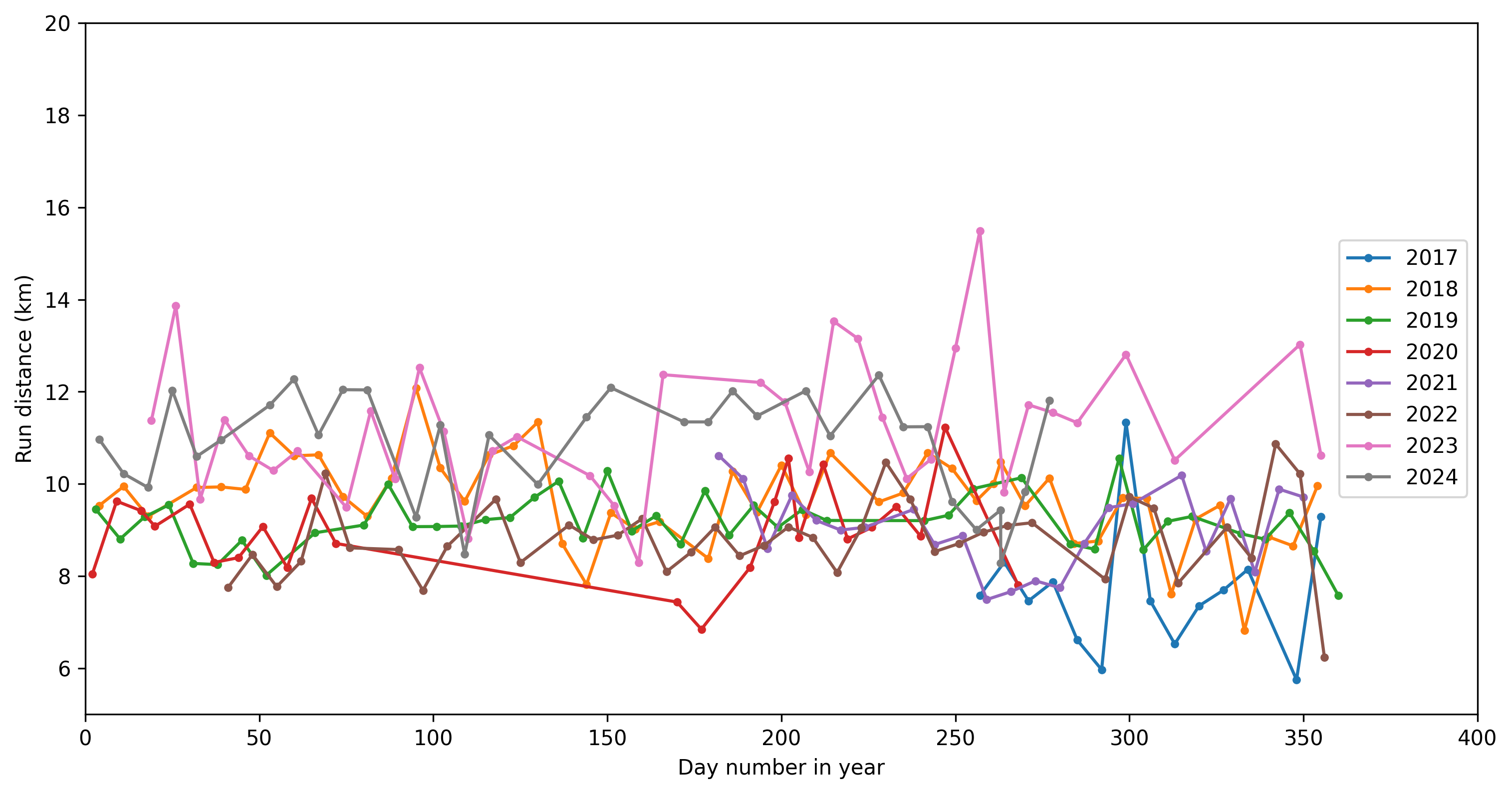
Distances, how long are those runs? That’s one of the first question I asked myself. From my Python notebook:
list_starting_date =["2017-09-14","2018-09-14","2019-09-14","2020-09-14","2021-09-14","2022-09-14","2023-09-14","2024-09-14","2025-09-14"]

for c, aa in enumerate(np.arange(len(ttrgpx.list_starting_date)-1)):
    select_run_df = all_last_traces_info_df[(all_last_traces_info_df.index >= list_starting_date[c]) &
                                              (all_last_traces_info_df.index < list_starting_date[c+1])].copy()
    mean_val = select_run_df["cumulative_distance"].mean() / 1000

    print("About {0:1.0f} social runs for season {1:1.0f} and an average of {2:02.2f}km per run.".format(len(select_run_df),aa+1, mean_val))
I obtain:
About 48 social runs for season 1 and an average of 9.27km per run.
About 47 social runs for season 2 and an average of 9.19km per run.
About 35 social runs for season 3 and an average of 9.02km per run.
About 11 social runs for season 4 and an average of 9.20km per run.
About 41 social runs for season 5 and an average of 8.78km per run.
About 40 social runs for season 6 and an average of 10.41km per run.
About 38 social runs for season 7 and an average of 11.24km per run.
About 19 social runs for season 8 and an average of 11.74km per run.
where each season goes from September to September.
And the same information in a graph:
Getting visualizations
I could look at each run alone, but I can also display all the runs and display in red the longest of the the run recorded so far, in green is displayed the last added run to the database.
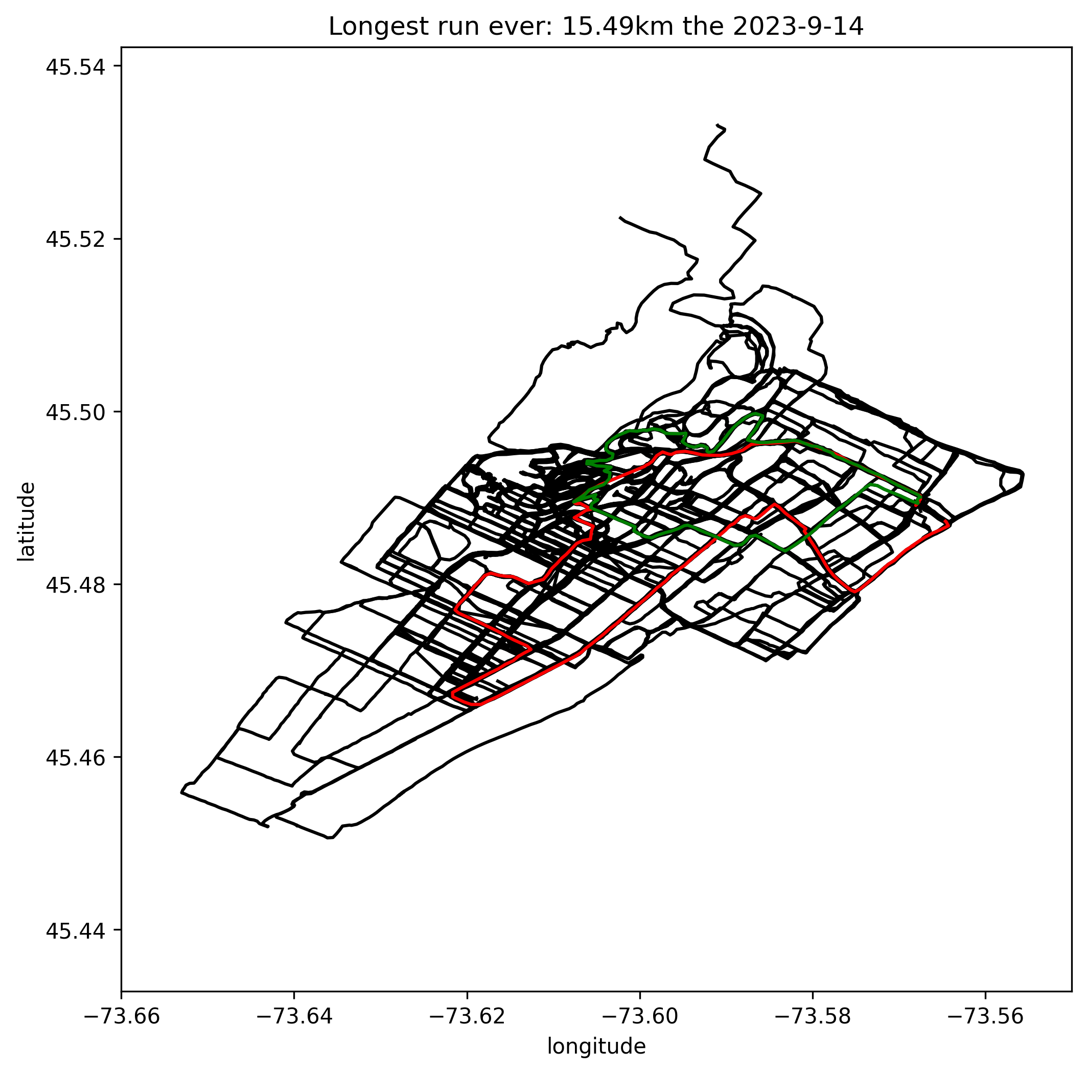
Interesting fact, this longest run was to celebrate the 6th anniversary of the run club and we did pass by all the former starting points since its birth.
Following the season axes I have created one graph per season. Each graph had red points representing the different starting points, and a green point showing the top of the run meaning most of the time we will start our descent just after.
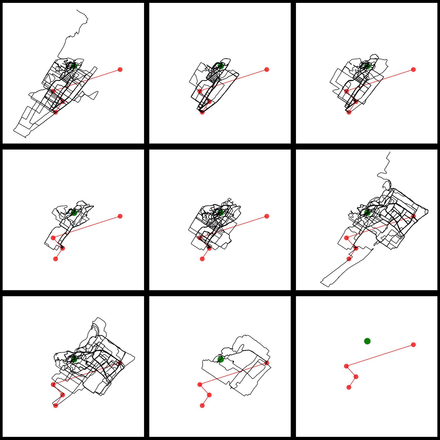
Interesting fact, to reach this green point - Summit Circle above Westmount - was presented to me as a mandatory checkpoint of the run (or I remembered it like that), but looking at all the gps traces did show me that at the beginning it was mostly a flat run, and it escalated quickly :-)
Conclusions and future work
It is not a surprise, but what took me most of the time was to gather data, clean data, organize my database to be able to start query information from that same database.
Something I’m missing is data about runners showing up. When I joined, to be 20 people was huge, now we are at least 50 and we did increase the millage as well, so the distance is not a deal breaker. Of course changing the run starting point has brought more people, we are in a more dense area, it is easier to join, we have place at Ciele where to leave a bag before running, but we do have people coming from far. My guess is the Covid effect had an impact on increasing the number of people practising the act of jogging, but it is just a guess from me alone.
For now I like those visualizations but those static visualizations don’t illustrate how we did mapp the city in motion. We neither don’t feel in those graphs how much we climb half of the run. So I need to work in animation to get a glimpse of how we self organized our exploration, how the speed change in the middle of the run and that’s where I need to up lift my TouchDesigner skills.
Bonus track
Using folium I managed to overlay the gps run traces on the top of a map, and you can interactively zoom in and out. Of course you still need some guidances if you want to know more about those data, but you can guess from where the runs have started over the years. What it shows is the paths the run club was following from 2017 to summer 2024 at least.